Dashboards
Explore and visualize your data however you want. Our dashboards make analysis flexible and vivid.
What are dashboards?
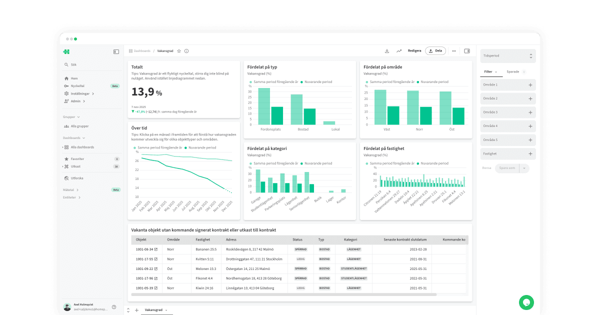
Dashboards are where data turns into insight. They let you combine metrics, filters, and visualizations into flexible, interactive views.
How it works
A dashboard consists of widgets — visual components that can display anything from metrics, charts, and tables to images or plain text.
You can create multiple tabs to organize your content or highlight specific areas.
Use time periods and filters to analyze the exact data you need.
Drill deeper into your charts by viewing detailed data or breaking it down further.
Share dashboards externally, with colleagues, on TV screens, or embedded in other web applications.
How to use dashboards
Haven’t created a dashboard yet? Read more here: Create a dashboard→
Time period
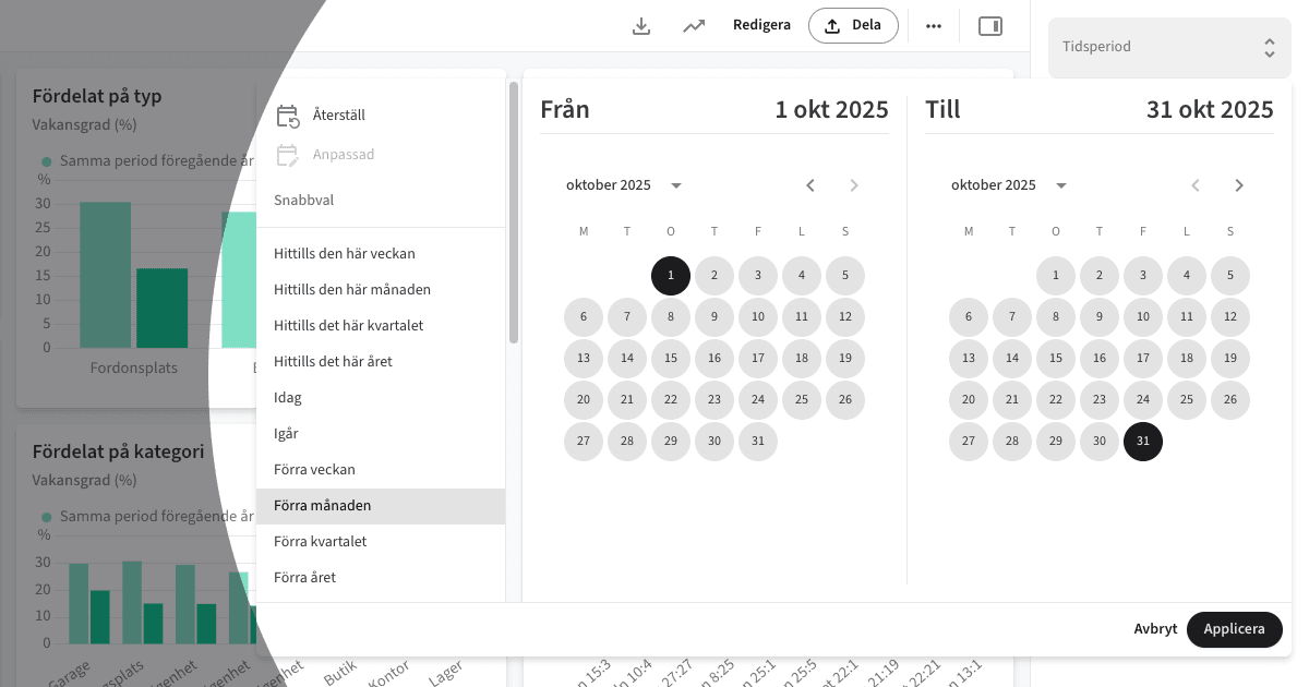
The most important filter is the time period. Here you select the time range that the dashboard should display. You can choose from preset options (e.g., Last month) or enter custom start and end dates.
The filters in a dashboard’s sidebar are completely user-specific and temporary — they don’t affect the organization or other users.
Filters
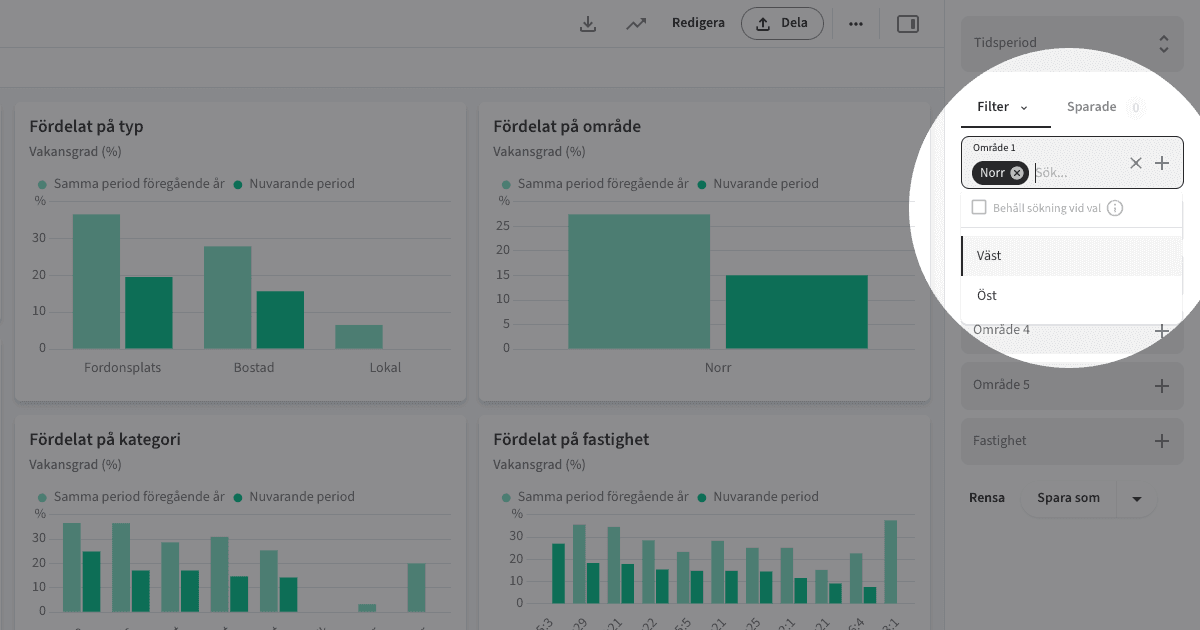
In addition to the time filter, the dashboard owner can add custom filters to enable more targeted analysis — for example, Region or Property, where users can display data for one or several values.
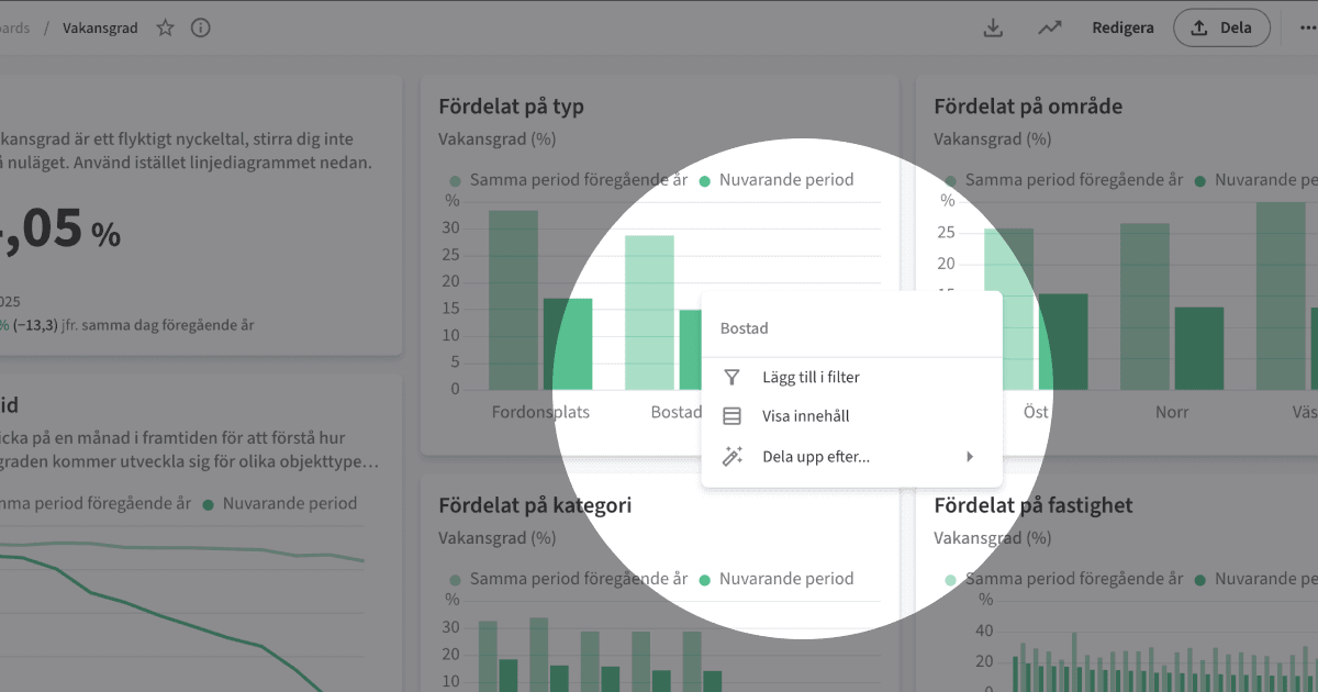
You can also filter directly by clicking an element in a chart (for example, Residential) and selecting Add to filter.
The filters in a dashboard’s sidebar are completely user-specific and temporary — they don’t affect the organization or other users.
Saved filters
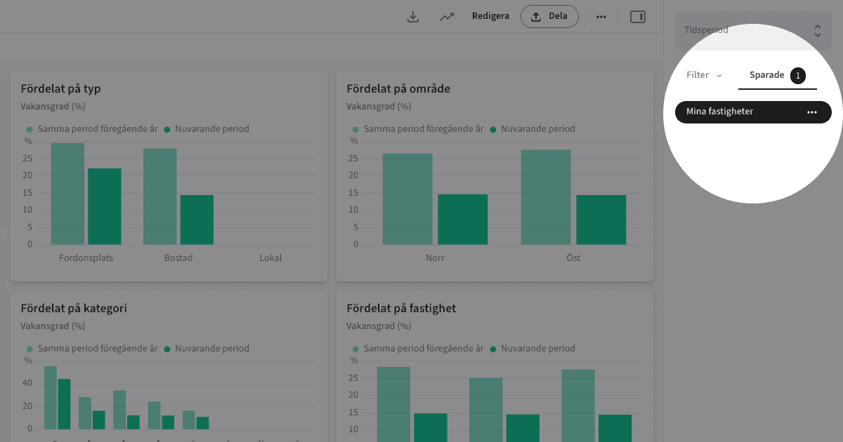
You can save a specific filter setup for later use. For example, you could select Orange 21:1, Orange 2:21, and Orange 8:25 under Properties, then save that combination as My properties.
Flikar
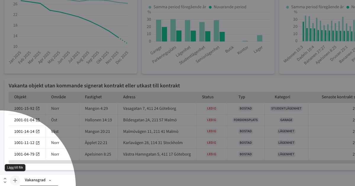
A dashboard can have multiple tabs so you’re not limited to a single layout. Add, move, copy, or duplicate tabs — each one can also be shared publicly or embedded (Embed→)
Note! More tabs aren’t always better. Data shows that dashboards with fewer, focused tabs get significantly more engagement.
Embed
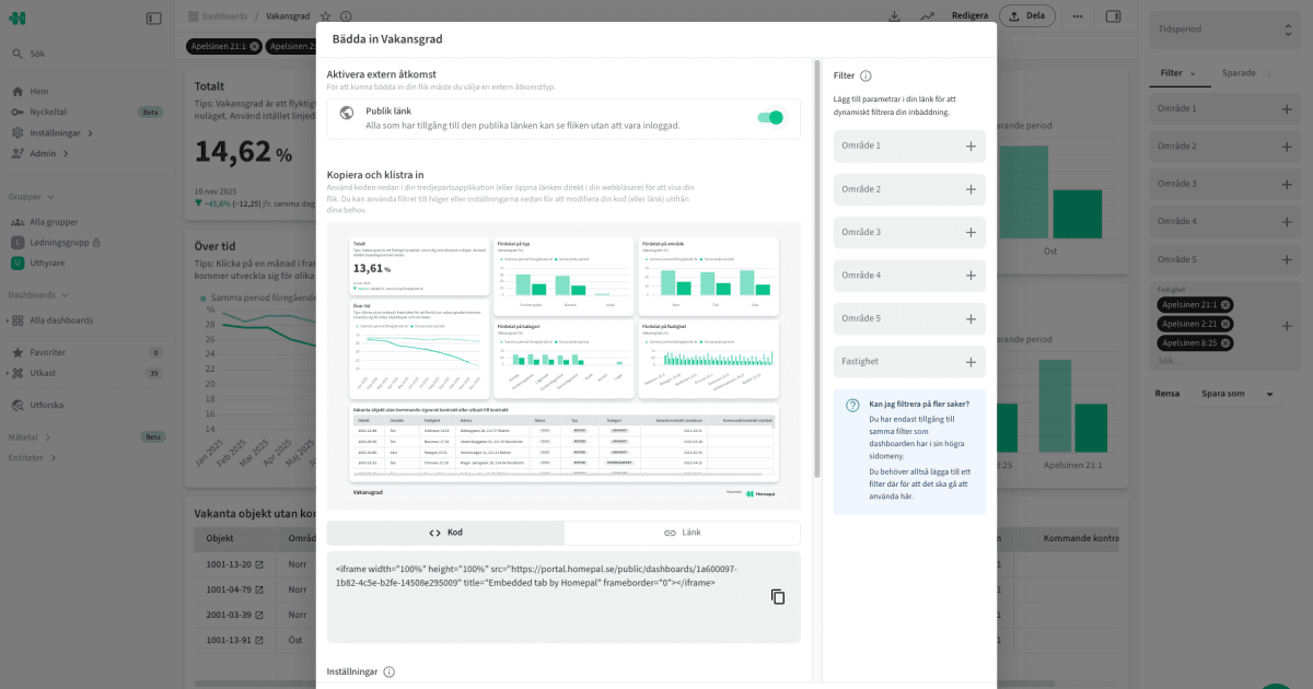
To embed a dashboard tab, you first need to enable Public Link.
Copy code to embed the tab on an intranet, portal, or website.
Copy link to share it externally or display it on a TV screen.
Dynamic filters can also be applied to specific embeds.
Share

Share dashboards with users and groups by clicking the Share button and adding them. (If the user doesn’t exist yet, invite them directly via email.)
A private dashboard is only visible to added users and groups.
A public dashboard is visible to the entire organization.
To make a dashboard appear on a group’s page, that group must be added here.
Activity overview

Open the Activity overview to track how many views a dashboard has received over time and see which users have visited it.
Break down
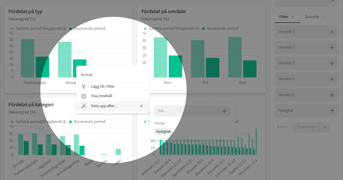
Click an element in a chart to open available options, select Break down by..., and choose what to split the data by.

For example, you might click the Residential bar and break it down by Property.
Show content
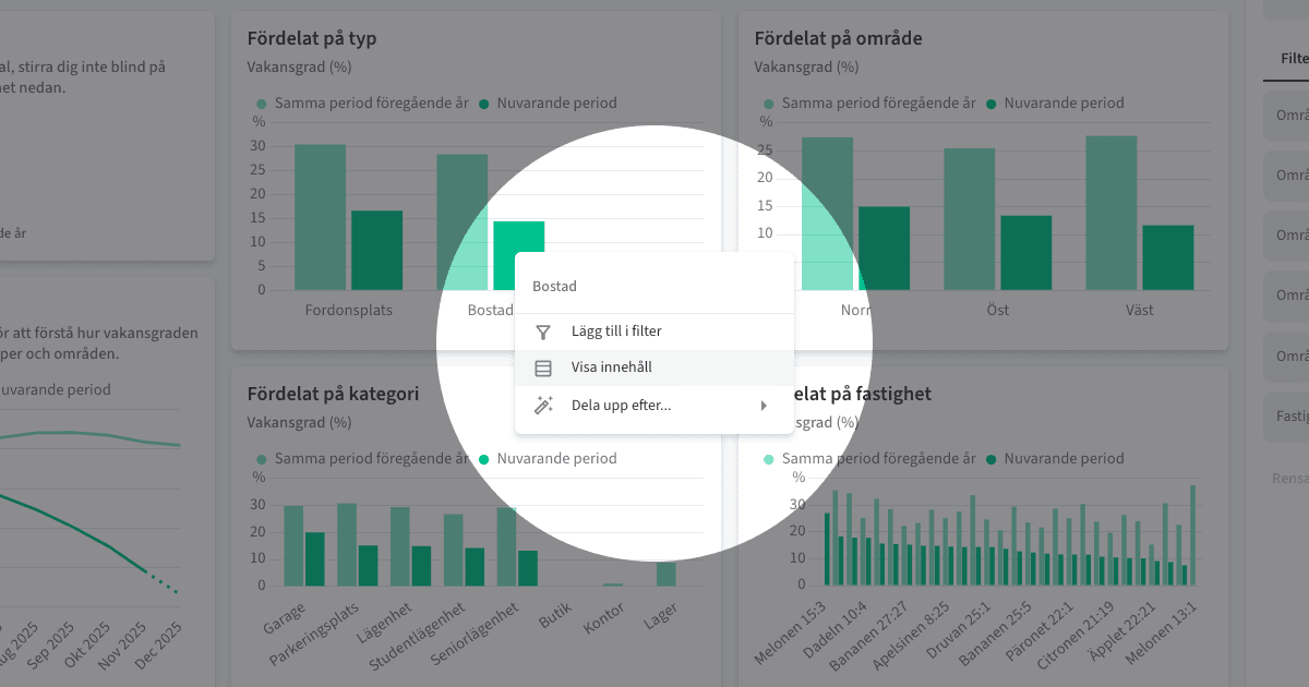
Click an element in a chart and select Show content to open the underlying data at the row level.
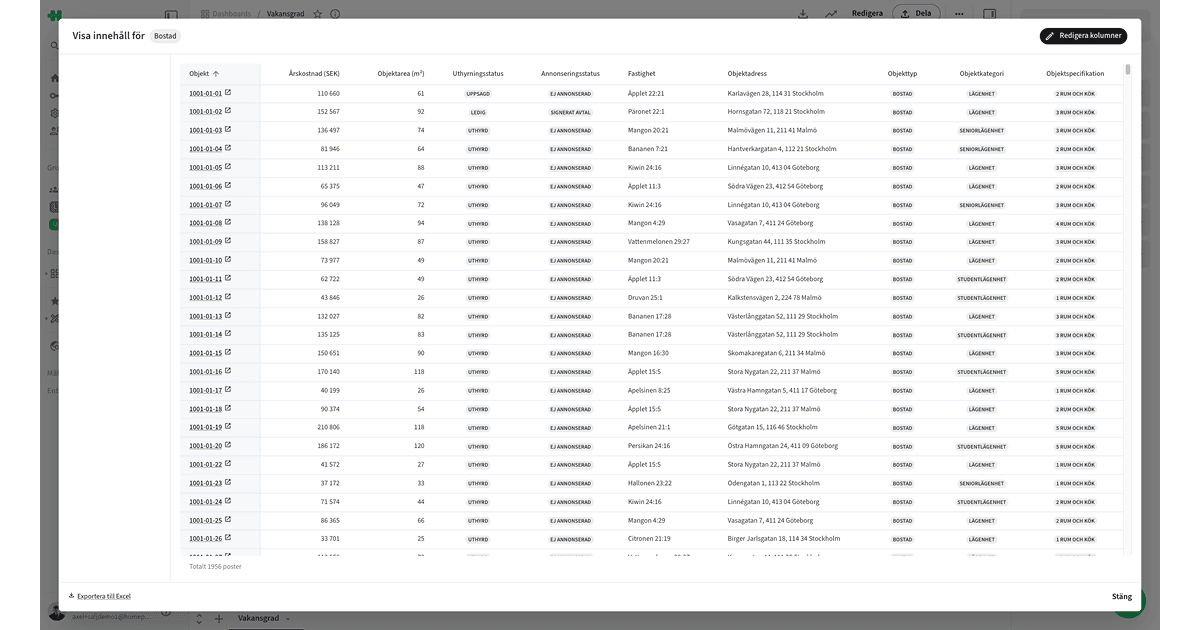
You can temporarily add more columns via Edit columns. The default columns are defined by your system administrator under Entities→
In the lower-left corner, you can also Export to Excel.
Visualization
A widget (with a metric) in a dashboard can be visualized using:
Number
Bar chart
Time series
Table
Pie chart
Bubble chart
Combo (Bars + Lines)
Each visualization type has its strengths and is suited for different use cases.
Tips
Keep dashboards few, small, and focused — quality over quantity always wins.
Try displaying simple dashboards on TV screens — perfect for shared spaces and team visibility.
Copyright © Homepal AB 2025